Selecting packaging colours
What is the colour wheel, and how can you use it to attract customers?
Graphic designers, brand managers, and packaging designers all have one thing in common: an innate understanding of how different colours can influence specific consumer groups.
Colour psychology is one of the most effective design strategies. Using a specific shade or hue can be the difference between brand recognition and successful sales figures or being ignored by your target customers, and choosing the right combination of colours is just as important.
The colour wheel allows for selecting colours that complement each other well. Also known as the colour circle, it shows the relationships among primary, secondary, and tertiary colours. Colours on the opposite sides of the colour wheel are considered to work well together. Other methods, such as split complementary, analogous, or triadic colour selection, can achieve a range of different aesthetics.
But how can you use the colour wheel to create successful packaging?
In this guide, we’ll cover how you can select complementary colours, what analogous colours are, and the advanced techniques involved. We’ll also explore why you should consider tints, shades, and tones, and how this ties into broader colour psychology.
Contents
Introduction
The importance of packaging colour
Before starting, it is essential to consider how vital colour can be in packaging design.
For example, studies suggest that colour drives 80% of brand recognition. 93% of consumers also make purchasing decisions based on the visual appearance of products (and, by extension, their packaging). The majority of consumers make a purchasing decision within 20 seconds.
These statistics are why colour psychology assumes such importance.

Colour psychology is, in essence, the emotions, feelings, or associations that specific colours elicit.
Common examples include using reds and yellows for brands targeting youthful markets. Green branding and packaging suggest to consumers that products are fresh and environmentally friendly. Even subconsciously, the perception of blue is trustworthy, dependable, and intelligent (which is why it is common in consumer electronics brands).
In short, selecting a colour for your packaging shouldn’t be a decision you make lightly (or without adequate care and research).
Using a combination of colours
Knowing the type of message or emotion that colours evoke in packaging colour psychology is only the beginning.
To create a striking packaging design that truly reflects your brand purpose or the characteristics of your products, it is usually necessary to use more than a single colour.
The use of high contrast colours can make specific design elements more noticeable and prominent. Text, symbols, graphics, and other design elements can stand out when used with carefully chosen contrasting colours.
For example, a red-and-yellow colour scheme would provide sufficient contrast, whereas orange and yellow are too similar and result in elements that lack clarity and visual standout. Darker colours contrast best with lighter colours.
The colour wheel

This is where the colour wheel comes in.
It allows you to select colours that work well together using a number of different strategies.
Whilst brands typically don’t want to use more than two or three colours on their packaging (or risk the design becoming too confusing, garish, and visually unappealing), there are several ways to ensure a balanced, harmonious aesthetic for your printed packaging.
Colour definitions
Primary, secondary, and tertiary colours
Before detailing how the colour wheel can help when designing your packaging, it is essential to define the structure of the colour wheel and the different colours within it.
Primary colours
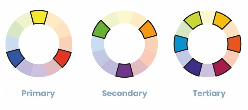
Primary colours are the three colours that, when mixed, create all other colours: red, yellow, and blue.
Whilst general colour theory uses these primary colours, it is vital to remember that the colours used when printing (to achieve the other shades) are cyan, magenta, yellow, and black. These colours are commonly known as CMYK.
Any packaging designs must use CMYK colour, not RGB (red, green, blue), which is used for screens, websites, and online applications. You can see this and other packaging artwork mistakes to avoid in this guide.
Secondary colours
Secondary colours are those generated by mixing (in equal amounts) two of the primary colours.
As such, the three secondary colours are green, orange, and purple/violet.
Tertiary colours
Tertiary colours are the remaining colours on the colour wheel. However, their technical definition is colours created by saturating one primary colour and half-saturating a second primary colour.
Another way to describe this is mixing equal amounts of primary and secondary colours.
The tertiary colours on the colour wheel are yellow-orange, red-orange, red-violet, blue-violet, blue-green, and yellow-green.
Using the colour wheel
Selecting more than one colour for your packaging
Many people (wrongly) assume that arbitrarily selecting several attractive colours, which may be appealing in isolation, results in a pleasing design aesthetic, but the result is frequently the opposite.
In fact, it is important to select colours that work well together. Using the “colour wheel” is one of the easiest ways to choose these so-called “complementary colours”.

Complementary colours
Generally speaking, colours on opposite sides of the wheel are commonly agreed to complement each other. So, for example, blue pairs well with orange, yellow with purple, and red with green.
In addition to working well together, complementary colours also provide sufficient contrast in your packaging design and create an attractive, eye-catching appearance.
Split complementary colours
A similar colour wheel technique is known as “split complementary” colour selection. This idea involves using the adjacent colours on the opposite side of the colour wheel.
For example, if blue is your primary colour, the complementary colour (on the colour wheel) would be orange, and the split complementary colours would be red-orange and yellow-orange on either side of it.
This approach allows you to add three colours to your packaging whilst ensuring they all work well together (and create a hierarchy of shades).
Analogous colours
So, whilst the colour circle allows you to select shades that are widely agreed to work well together, this is just the beginning of how you can use this tool.
A popular tactic is the use of analogous colours. Using analogous colours is an approach in which a design consists of three grouped colours (e.g., next to each other) on the colour wheel.
For example, blue, violet, and turquoise (blue-green) are analogous colours.
This technique is common in packaging design, as it allows a clear hierarchy of dominant, supporting, and accentuating colours to be used whilst maintaining a balanced visual appearance.
Advanced colour wheel techniques
Triad, tetradic, or square colours
One of the triadic, tetradic, or square colour combinations can be used in packaging designs to create a mixture of contrast and harmony.

Triadic uses three evenly spaced colours on the colour wheel when selecting shades. This technique is similar to the principle that the three primary colours (red, blue, and yellow) are evenly spaced around the colour wheel.
Both tetradic and square combinations utilise four colours (pushing the number that a single packaging design can sensibly accommodate to the limit), with different spacing being the main difference.
Whilst arguably too much in some applications, these methods of colour selection can yield interesting results (especially when capturing attention is the main priority).
Other colour selection strategies
Tints, shades, and tones
The use of tints, shades, and tones is another technique for creating striking packaging design.

A tint is the addition of white to the colour in question or, in some cases, printing less ink. A shade involves using black to darken the colour, whilst a tone is where varying amounts of black and white (effectively forming a grey) make the shade less bright and intense.
The use of tints, shades, and tones can create a hierarchy of design elements, but with a considerably more subtle colour palette than the other colour wheel techniques (which can be too bright for some applications).
This idea can also minimise costs by limiting the number of inks required for a specific design.
Monochromatic colours
Tints, tones, and shades can also be used to achieve the final technique – monochromatic colours for packaging design. Monochromatic uses a single colour in its varying tints, tones, and shades to create the design.
The result is a clean, well-coordinated appearance. However, another key benefit is that using a single ink can help keep packaging costs low (making this popular for lower-priced goods and more industrial-type packaging).
Summary
Using the colour wheel for branding and packaging
While recognised as a hugely important tool for branding, the colour wheel is equally crucial for packaging design and print.
Selecting complementary colours can play a significant role in capturing consumer attention, ensuring your packaging is clear and easy to understand, and ultimately helping to win new customers.
When used in conjunction with colour theory and psychology, your choice of colours can have a surprisingly significant impact.
If you require any assistance with the printed packaging, eCommerce boxes, or transit cartons used at your business (and ensuring the colours you use are on point), then please get in touch with our team of packaging experts.
Share this article
Further reading
About the author

Jay joined GWP Packaging in 2008, before going on to hold senior positions at VPK and Cotswold Packaging. He maintains close ties with GWP and Macfarlane.
Featured products
Get in touch
Related guides
10 packaging artwork mistakes (and how to avoid them)
13 tips for choosing packaging colours
Packaging colour psychology – how it affects your business
Litho vs. digital print for packaging
Printed cardboard packaging – your options
Printed eCommerce packaging ideas
Recycling symbols on packaging (+ free downloads)
Corrugated board grades explained: types of cardboard
Transit packaging symbols (meaning and downloads)
Branded and printed sample cases – 9 visually striking ideas


