The importance of colour selection
Why using colour psychology for your packaging is essential
Colour psychology is the study of how colours affect human emotions, behaviours, and decision-making. In the context of packaging, it becomes a silent but potent communicator: the hue, brightness, saturation, and contrast you choose can influence how customers perceive taste, value, and credibility, sometimes even unconsciously.
Consider this: in a lab experiment, warm packaging colours (e.g., reds and oranges) increased expectations for taste and indulgence, while cool colours (e.g., blues and greens) led people to ascribe more healthiness or sustainability to the same products, though interestingly, the cool colours also diminished perceived “tastiness” in some cases.
Another study by Frontiers found that for “vice” foods (e.g., indulgent treats), warm colours boosted purchase intent, but for “virtue” foods (more health-oriented), cooler colours were more compelling.
Finally, the concept of “sensation transference”, coined by psychologist Louis Cheskin, reminds us that consumers often transfer their feelings about packaging onto the product itself. In his experiments, identical formulas packaged in different colours produced distinct reactions, simply because the packaging suggested different qualities.
In short, when you select colour for your packaging, you are doing more than decorating; you’re influencing consumer perceptions, expectations, and even buying behaviour.
In this guide, we’ll examine the details of specific colour associations and how you can leverage them to enhance the performance of your packaging.
What should you consider before picking your colour palette?
What does your packaging say to your customers?
Before you reach for your swatches, pause to reflect on these foundational factors; skipping them can lead to a package that either miscommunicates or blends into the crowd.

Know your target audience and product positioning
Colour associations are not universal; what resonates with younger consumers may feel off to older ones. Cultural contexts can shift meaning, for example, while red might stimulate appetite in one market, in another it might evoke caution or danger.
Align your colour choices with both who you are speaking to and the emotional role you want your brand or product to play.
Consider context, contrast, and category norms
What colours do your competitors or your product category typically use? In saturated categories, adopting an unexpected hue can help your product stand out.
Explorer Research highlights that sometimes “off-category” colours are more memorable and differentiating.
However, stepping too far outside visual norms can also confuse consumers, so contrast must be deliberate and supported by branding cues (logos, typography, and messaging).
Balance aesthetics with psychological intent
Don’t just pick the colours that you like. Work from the emotions or brand promises you want to evoke (e.g., trust, premium, fun, or eco-friendly), and let that guide your colour palette.
Always limit yourself to a controlled set (two or three complementary or contrasting hues) to maintain clarity and avoid conflicting signals.
Also, test the colour combinations in real-world lighting and formats; what looks good on screen may behave differently on printed materials or in-store lighting.
Colours and their emotional associations
In short, the varying colours, when used in packaging, are associated with the following emotions, messaging, and brand values:
- Red: Excitement, bold, youthful, passion, zeal, warmth, strength, power, action, enthusiasm, love, desire.
- Orange: Friendly, cheerful, confident, fun, adventurous, warmth, cost-effectiveness, creativity.
- Yellow: Cheerful, clarity, warmth, optimism, fun, energy, happiness, confidence.
- Green: Soothing, freshness, growth, peaceful, healthy, eco-friendly, harmony, security, wealth.
- Blue: Calming, trustworthy, efficiency, serenity, logic, intelligence, dependability, strength, honesty.
- Purple: Indulgence, luxury, opulence, spirituality, nobility, wisdom, exclusivity.
- Turquoise: Calmness, purity, clarity.
- Pink: Femininity, calming, beauty, youthful, playful, love.
- Brown: Earthy, comforting, security, natural.
- Black: Elegance, premium, sophistication, authority, strength, mystery.
- White: Simplicity, elegance, purity, innocence, goodness, humility, cleanliness, new beginnings, and premium.
- Grey: Calm, neutral, balanced.
Red
Excitement, passion, and boldness
Red is a high-energy, attention-grabbing hue. On packaging, it evokes urgency, excitement, strength, and dynamism.
Used deliberately, red can help products stand out on the shelf, but because it’s so visceral, it can also feel aggressive or overbearing if misused. In food and beverage categories, red is often used to stimulate appetite or create impulse appeal. It’s a favourite among lifestyle, entertainment, and snack brands.

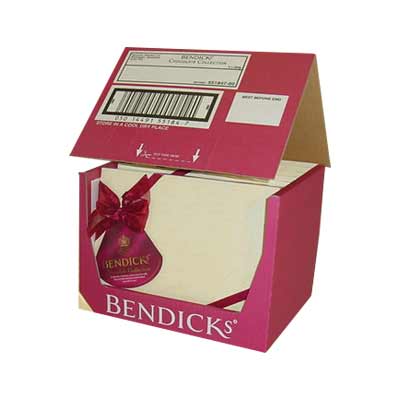
Within red itself, nuances matter: brighter, almost neon reds read as youthful and energetic, whereas deeper reds (such as burgundy or wine) can feel more premium and elegant.
Designers must consider the legibility of text or graphics on red as they need high contrast to remain readable.
- Communicates: Excitement, bold, youthful, passion, zeal, warmth, strength, power, action, enthusiasm, love, and desire.
- Popular brands: Coca-Cola, KFC, Nescafé, Vodafone, Netflix, LEGO, and Virgin.
- Industries: Food and beverage, retail, lifestyle, and entertainment.
Orange
Warmth, friendliness, and creativity
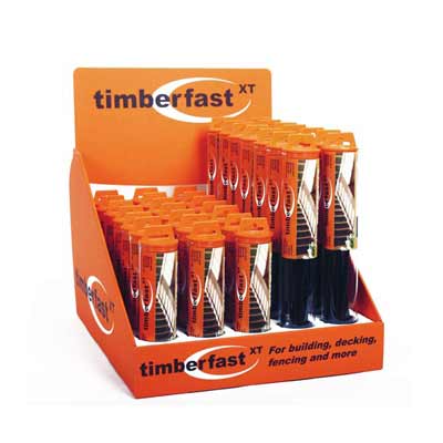
Orange sits between red’s urgency and yellow’s optimism, making it a warm, cheerful, and approachable hue.
It can connote affordability or economy in some contexts, but when paired with strong visual elements, it feels confident and fun. As orange is less commonly used than colours like red or blue, it can offer differentiation, but it requires careful handling to avoid being read as cheap or garish.

Orange works particularly well for brands aiming for a playful, social, or youthful personality. It plays nicely alongside complementary colours like blue or teal, allowing design flexibility without muddying the message.
- Communicates: Friendly, cheerful, confident, fun, adventurous, warm, cost-effective, and creative.
- Popular brands: Fanta, Nickelodeon, Firefox, Quron, and B&Q.
- Industries: Food and beverage, and DIY.
Yellow
Optimism, energy, and visibility
Yellow is a bright, uplifting colour associated with optimism, energy, creativity, and youthfulness, because it’s vivid and attention-seeking. Yellow is often used as an accent or combined with another hue to temper its intensity.
It’s particularly effective when a brand wants to convey a sense of approachability, forward thinking, or cheerfulness.

In practice, pure yellow packaging often skews toward younger audiences (children and teens), but mixed palettes can broaden appeal.
For example, Subway’s combination of yellow and green is a classic example: yellow evokes energy, green conveys freshness and natural ingredients.
Yellow is especially common in fast food, delivery, and marketing-focused retail packaging.
- Communicates: Cheerful, clarity, optimism, fun, energy, happiness, and confidence.
- Popular brands: McDonald’s, Shell, DHL, Ferrari, Subway, National Geographic, and JCB.
- Industries: Delivery and fulfilment, construction, plant equipment, and fast food.
Green
Nature, health, and harmony
Green has broad appeal thanks to its associations with nature, growth, health, calm, and environmental responsibility.
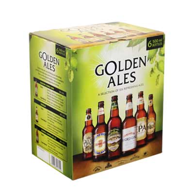
In packaging, it’s often used to signal organic, eco-friendly, or health-forward products. However, the meaning of green can shift depending on its tonal quality: bright greens evoke a fresh and energetic feel; deeper greens suggest stability and luxury; olive or earthy greens convey a sense of grounding and rusticity.

One trap to watch for is “greenwashing”, when brands overpromise environmental credentials through colour alone without backing it up with real sustainability practices.
Using green demands authenticity. Also, in food categories, green can imply freshness or sustainability but may conflict with expectations of “flavourful” in some product types.
- Communicates: Soothing, freshness, growth, peaceful, healthy, eco-friendly, harmony, security, and wealth.
- Popular brands: Subway, Starbucks, BP, Land Rover, Waitrose, and Lloyds Bank.
- Industries: Banking, medical, health and wellbeing, and food.
Blue
Trust, intelligence, and calm
Blue is arguably one of the safest, most trusted colours in packaging and branding.
It conveys stability, reliability, intelligence, and calm, which are reasons many financial, tech, healthcare, and pharmaceutical brands adopt blue as a primary brand colour.
In consumer electronics, especially, blue signals competence and precision.

However, “safe” also means saturated categories: many brands use some form of blue, so reliance on design detail, texture, and contrast becomes crucial in standing out.
Within blue, darker shades are perceived as more serious or mature, whereas lighter blues can convey a sense of freshness, youthfulness, and innovation.
- Communicates: Calming, trustworthy, efficient, serenity, logic, intelligence, dependability, strength, and honesty.
- Popular brands: HP, Dell, Facebook, Oral-B, Ford, Pfizer, Pepsi, Gillette, and Samsung.
- Industries: Electronics, software, pharmaceuticals, and medicines.
Purple
Luxury, creativity, and spirituality
Purple has long been tied to royalty, tradition, and mystique. In modern packaging, it suggests indulgence, exclusivity, wisdom, and premium quality.
Purple is not overused, making it ideal for brands seeking sophistication without the black-and-white clichés. It’s especially apt in beauty, wellness, or product lines that position themselves as elevated or boutique.
One nuance: in some markets, purple leans feminine, so pairing it with unexpected tones (e.g., metallics or muted neutrals) can broaden its appeal. Also, lighter mauves or lavenders bring softness, while deep purples convey richness.
- Communicates: Indulgence, luxury, opulence, spirituality, nobility, wisdom, and exclusivity.
- Popular brands: Cadburys, Hallmark, Premier Inn, Aussie, and Yahoo.
- Industries: Food and drink, and luxury products.
Turquoise
Clarity, calm, and purity
Turquoise occupies a mid-blue to green territory and often feels crisp, clean, and modern. In packaging, it conveys clarity, purity, calm, and balance.
It’s especially effective in health, personal care, or cleaning product categories, where you want to suggest cleanliness without sterility.

As turquoise is less common, it can help your packaging stand out and feel distinctive and fresh. That said, due to its relative rarity, you’ll want to ensure that other visual elements, like typography and imagery, support the intended messaging so that turquoise doesn’t feel arbitrary.
- Communicates: Calmness, purity, and clarity.
- Popular brands:
- Industries: Health and cleaning products.
Pink
Softness, femininity, and playful
Pink is often associated with youth, beauty, care, and affection. In packaging, softer pastels convey a gentle and nurturing tone, while brighter magentas or hot pinks evoke a bold, playful, and modern feel.
One advantage of pink is its rarity outside of specific categories (fashion, cosmetics, or baby products). Used strategically, it can help a brand break visual norms. The key is to stay true to your target customer; pink may delight some, but alienate others if not aligned with your audience.
- Communicates: Femininity, calming, beauty, youthful, playful, and love.
- Popular brands: Barbie, Victoria’s Secret, T-Mobile.
- Industries: Healthcare, cosmetics, and fashion.
Brown
Warmth, earthiness, and simplicity
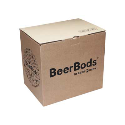
Brown and Kraft tones evoke a sense of naturalness, warmth, and grounded authenticity. In packaging, brown is often used by brands that want to emphasise sustainability, minimalism, or rustic character.
Especially when paired with a single accent colour, brown packaging can “speak” about the eco credentials of a product while still feeling premium.
One strength of brown is that it avoids the high-gloss, high-production finish.
It’s raw, rugged, and honest, a good match for brands that don’t want to overpromise. However, in premium categories, too much brown without contrast can risk looking too plain; strong branding cues are needed.
- Communicates: Earthy, comforting, security, and natural.
- Popular brands: M&Ms
Black
Luxury, authority, and mystery
Black is powerful, elegant, authoritative, and timeless. In packaging, black implies strength, sophistication, and exclusivity.
Many luxury or “special edition” products use black to differentiate themselves from their standard lines, because black pairs easily with almost any other colour, it’s a versatile anchor in your palette.

However, black must be balanced – too much, especially with glossy finishes, can feel heavy or inaccessible.
Additionally, legibility is a concern: type and graphic elements must be clearly distinguishable. That said, black’s ability to confer premium status makes it a favourite in high-end cosmetics, electronics, and limited edition runs.
- Communicates: Elegance, premium, sophistication, authority, strength, and mystery.
- Popular brands: Nike, Adidas, and Audi.
- Industries: Consumer goods, automotive, and sportswear.
White
Purity, simplicity, and freshness
White is often equated with cleanliness, purity, and minimalism. In packaging, it suggests openness, freshness, and new beginnings.
Use of white space can elevate a design, giving it room to breathe and appear high-end. Many luxury, medical, and skincare brands adopt white as a primary background or accent colour.

One practical benefit: white works superbly with colourful accents, allowing those accent colours to shine.
In corrugated packaging, especially, white is an alternative to kraft that retains a premium feel. The primary caution is avoiding blandness: contrast, texture, and careful layout are essential to prevent white packaging from feeling sterile.
- Communicates: Simplicity, elegance, purity, goodness, humility, cleanliness, new beginnings, and premium.
- Popular brands: Apple, Tesla, and Calvin Klein.
- Industries: Luxury goods, high-end consumer electronics, medical products, and cosmetics.
Grey/silver
Balance, modernity, and sophistication
Grey and silver occupy a subtle modern middle ground. They’re commonly used by brands that want to appear neutral, sleek, contemporary, or balanced.
Grey packaging often feels calm and composed, making it a good fit when you want to avoid strong emotional cues while still looking refined. In many higher-end or design-forward product categories, silver or metallic greys also convey premium quality.

As grey is understated, it tends to complement more expressive accent colours well. But its subtlety also means it can fade into the background in retail settings; you’ll need to ensure contrast, finishing, or textural elements are strong enough to give it presence.
- Communicates: Calm, neutral, and balanced.
- Popular brands:
Summary
Colour psychology for packaging
Whilst many businesses do not even consider how the colours they use can affect sales and how their brand is perceived, doing so can prove a significant competitive advantage.
Packaging colour psychology is a strategic tool that can influence consumer perceptions, emotions, and ultimately, buying behaviour.
It is, of course, essential to consider your target consumers, the use of the packaging, what your competitors are doing, and consistency with your existing branding.
However, equally important is that if a carefully chosen colour can help nudge potential customers towards your products, you must get your packaging colours right.
For help with packaging colour psychology, get in touch with one of our packaging experts at GWP today.
Share this article
Further reading

About the author

Matt joined GWP in 2012 as Marketing Manager, and is now involved with sustainability and the promotion of Macfarlane’s manufacturing businesses.
Products in this guide
Get in touch
Related guides
10 packaging artwork mistakes (and how to avoid them)
13 tips for choosing packaging colours
Litho vs digital print for packaging
Printed cardboard packaging – your options
Printed eCommerce packaging ideas
Recycling symbols on packaging (+ free downloads)
Corrugated board grades explained: types of cardboard
Transit packaging symbols (meaning and downloads)
Branded and printed sample cases – 9 visually striking ideas


