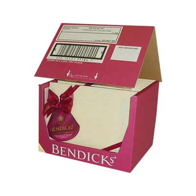
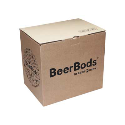
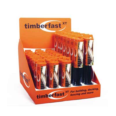
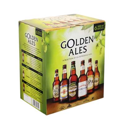
Printed packaging design
How packaging colours can affect your business's success
Any packaging designer, brand manager, and creative professional knows that colour can play a huge role in a brand’s popularity. What is less known is the similar impact that careful choice of packaging colours can have.
Wisely choosing packaging colours can significantly impact your business’s success. But it is critical to assess various factors. Points worth considering include colour psychology, consumer and cultural preferences, accurately reflecting your brand values and positioning, and differentiating yourself from competitors.
Selecting the right hues for your retail packaging can help to capture attention. It can delight customers when “unboxing” their eCommerce orders. It can help foster brand loyalty. It can even help brand recognition as your transit packaging travels through supply chains.
Given its often-overlooked importance, this guide provides several tips for selecting the right packaging colour for your business and brand. We’ll give an overview of the technical aspects of colour choices and psychology, explain why colour choice is so important, and provide a collection of tips and factors to consider when choosing packaging colours.
Contents
- Introduction
- Tips for selecting colours
- Core brand colours
- Consider brand positioning
- Consider product positioning
- Represent your product
- Know your customer
- Consider age and gender
- Use colours to invoke emotions
- Consider cultural preferences
- Stand apart from competition
- Consider material colours
- Consider minimalism
- Maintain consistency
- Summary
Introduction
The importance of packaging colour choice
A consumer’s first physical interaction with your business is rarely with your product – typically, it is with your packaging.
For online orders, this is the eCommerce packaging used to ship your products. In retail environments, it is seeing the box on the shelf. Even in B2B applications, the outer transit packaging is the first thing your customers see.
This interaction is why it is essential that your packaging makes the right first impression.

It must reflect your brand and product (positioning, personality, and value proposition) and should be memorable and easily recognisable. These factors are why carefully choosing packaging colours can be so important.
Colour psychology
The use of colours is so important for branding (and, by extension, your packaging) that considerable science is often involved in selecting an appropriate hue.
Scientifically selecting colours to elicit specific feelings is known as packaging colour psychology. Colours can have a surprisingly strong influence on human behaviour and emotions. These responses are involuntary and vary by gender, age group, culture, and other demographics.
Whilst the range of emotions that colours can invoke is a vast topic, some colours produce a predictable response:
- Blue, for example, is seen as trustworthy and innovative, and is typically used by technology companies.
- Red suggests energy, youth, passion, and can also stimulate hunger, hence fast-food chains and food packaging widely utilise this shade.
- Blacks, whites and greys suggest sophistication and premium offerings.
- Yellows and bright colours present a positive, cheerful message.
- Green is widely regarded as being environmentally friendly.
The science of colour selection
Beyond colour psychology, there are several techniques for selecting packaging colours. High-contrast designs, complementary colours (using opposite shades on the colour wheel), and even tints, shades, and tones within a single colour can all help create specific messaging for your packaging users.
However, simply sticking to the science may not necessarily produce the results you expect (or are hoping for).
So what else should be considered?
Well, many factors go into choosing the perfect colour for your packaging.
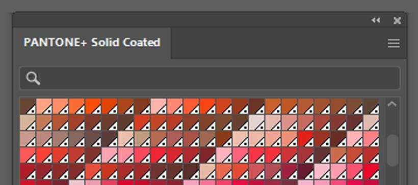
13 tips for choosing packaging colours
Important considerations when selecting packaging colours
So, without further ado, here are the 13 key considerations when selecting the colour of your packaging:
- Stick to your core brand colours.
- Consider your brand positioning.
- Consider your product positioning.
- Communicate purpose and personality through colour.
- Represent your product.
- Know your customer.
- Consider your target customers’ age and sex.
- Use colours to invoke emotions.
- Stand apart from your competition.
- Consider material colours.
- Consider minimalism.
- Maintain consistency with design and font.
Stick to your core brand colours
The importance of being able to recognise a brand
Perhaps most obviously, it is essential that your packaging reflects your existing brand identity. Even if you explore incorporating different colours to denote different product ranges or target other consumer groups, some use of your brand colours should remain visible.
Both existing and new customers should be able to recognise your brand through your packaging. They expect a consistent appearance across physical retail, online shops and websites, and packaging and products you supply.

Consider your brand positioning
Where does your business sit in the broader market?
Using colour psychology to select colours for your packaging (and indeed brand) can be a sensible strategy. However, businesses must ensure that the shades chosen accurately reflect their brand values and positioning.
For example, if you want to offer a premium product and target higher-value consumers, the packaging must reflect that. Even if you feel your brand should convey trust, for example, using blue when targeting premium segments could be a mistake (and you should consider white or black instead).
Colour choice should also allow you to tie in with your existing brand colours and identity (unless you are looking to break into new markets – which may require additional considerations).
Consider product positioning
Communicate purpose and personality through colour
Within your brand and product portfolio, you may have and in some cases are likely to have products targeting different price points and consumers.
Colour can be an excellent way to differentiate these ranges. However, care is required to allow consistency and the message you want to communicate about your products. Is a specific product representing value? Are others at the premium end of the scale? Are any related to eco-friendly lines or fun options for a particular segment?
Careful consideration should not just go into brand colours, but also into individual ranges.

Represent your product
Avoid confusing customers with unexpected colours
However, a common pitfall is a packaging colour that provides the desired messaging and positioning but confuses the customer.
A prime example would be using colours that are not associated with a specific flavour or variation of a product. For instance, orange-flavoured or scented products in green or purple packaging would not accurately represent your product.
Similarly, not using greens to portray an environmentally friendly product or packaging (when it is not) is essential. This form of greenwashing could potentially alienate your customers who would otherwise have been happy to purchase from your business.

Know your customer
Which colours appeal to your target audience?
These factors lead to perhaps the most crucial point: you must know your target customers.
Specific colours appeal to different ages, genders, socio-economic groups, cultures, and demographics. Even shades within a colour can make a big difference here, with bright pinks appealing to younger markets than dusky or lighter shades.
Also, be careful here not to be too generic. Blue packaging is the most popular among male consumers, but using this colour can make you stand out from the crowd.
Ultimately, your packaging should be a colour and design that your target consumer can relate to and find visually appealing.

Consider age and gender
Selecting colours appropriate for your market
Although there are many factors to consider when identifying your target consumer, two factors arguably play a more prominent role than any other – your customers’ gender and age.
Studies have suggested that teenagers and those in their 30s prefer purple packaging. Black packaging typically appeals to younger people, whereas children lean towards blues and greens.
Most men prefer blue packaging, although green and black are also good options for masculine brands. Purple, red, green, and blue are common choices for brands and packaging targeting females.
Surprisingly, considering it conveys cheerfulness, confidence, and warmth, not many consumers respond to orange packaging.
Use colours to invoke emotions
How do you want customers to feel about your product?
Colour can be surprisingly effective in eliciting target consumers’ emotions, feelings, and thoughts. Although this can vary by demographics (and even within similar groups depending on past experiences), using a suitable colour scheme can make your potential customers feel positive (or otherwise) about your brand.
Colour can also be associative. Associative colours can generate feelings of nostalgia, excitement, anticipation, calmness, and even security and dependability. If you know your customer well enough, you can leverage these emotions to your advantage.

Consider cultural preferences
Ensure choices are suitable for all regions and sales territories
It is also important to remember that colours can carry cultural meanings. The implications of different colours are fundamental when launching products into new markets or shipping internationally.
You must consider culture and heritage when creating packaging for specific regions or if you have strong sales in a particular country. An oft-cited example is that the colour red represents good luck in China.
Stand apart from your competition
Don't blend in with rival products
Choosing colours for your packaging that elicit a specific emotion among your ideal consumers can be a clever strategy, but what if all your competitors are doing the same?
Sometimes, it can be hard to differentiate between products and packaging on a shelf as they are all optimised to the same criteria.
It can often be worth taking a risk and seeing if you can position your brand apart from competitors in these circumstances. At the very least, using a colour outside the norm (if you are the only one doing it) can allow you to stand out, capture more attention, and become more memorable than your competitors.
Consider material colours
Can you use packaging materials for an interesting appearance?
When working with corrugated packaging, in particular, the colours of the material used in its manufacture can also have a surprisingly significant impact on how your packaging, products, and brand are perceived.
Many businesses now use Kraft material with green and white inks to create a natural, environmentally friendly message. Alternatively, white materials (and those using clay-coat liners or specialist surface coatings to provide a “sheen”) are ideal for more premium offerings.
How the colour of the packaging material you use combines with your chosen print colours is becoming increasingly important.

Consider minimalism
Less is more…
As with the consideration of material colours, many businesses are pivoting towards minimalism.
While now using many colours or print coverage, minimal design can create a premium “less is more” approach. Minimalism can work surprisingly well with corrugated packaging and can be in stark contrast to competitors using multiple colours.
A step-and-repeat pattern is another strong option for creating an impactful appearance with a single or very few colours.

Maintain consistency with design and font
Take a joined up approach
The final point to consider is that all elements of your packaging design should work together. It is no use using colours to create a premium appearance and then ruining it with a font that looks cheap and cheerful (or, similarly, with cartoon-esque graphics or icons).
Similarly, classy fonts (typically serif designs) used with bright colours can look jarring and out of place.
The fonts, icons, and graphics also send a message to customers. Making sure all design elements are pulling in the same direction is crucial.
Summary
Why you should choose packaging colours carefully
As you can see, choosing packaging colours can be more complicated than many would believe.
It is essential to consider how you want potential customers to view your product and brand. You must also bear in mind the emotions and feelings your packaging should convey, where it is used, and your position within the market. By doing this, you can create packaging that helps capture attention and ultimately improves sales.
Should you require any assistance with selecting packaging colours for your business, please get in touch with a member of the GWP team.
Share this article
Further reading
About the author

Jay joined GWP Packaging in 2008, before going on to hold senior positions at VPK and Cotswold Packaging. He maintains close ties with GWP and Macfarlane.
Featured products
Get in touch
Related guides
10 packaging artwork mistakes (and how to avoid them)
The colour wheel of branding and packaging
Packaging colours psychology – how it affects your success
Litho vs. digital print for packaging
Printed cardboard packaging – your options
Printed eCommerce packaging ideas
Recycling symbols on packaging (+ free downloads)
Corrugated board grades explained: types of cardboard
Transit packaging symbols (meaning and downloads)
Branded and printed sample cases – 9 visually striking ideas


